
Pantone recently announced its colour of the year for 2021, and its choice surprised a lot of commentators. For a start, the colour-matching company didn’t just stick with one colour, they picked two – Illuminating (a bright yellow) and Ultimate Gray.
What is Pantone?
US company Pantone’s colour-matching services are used by creatives and manufacturers working in industries from fashion and textiles to interior design to publishing to food. They facilitate the matching of colours to inks, pigments and dyes. The company also predicts what groupings of colours (palettes) might go down well with consumers. Pantone’s colour of the year inspires a lot of chatter and controversy among designers and anyone else interested in colour.
Why is Pantone’s colour of the year controversial?
2021 is not the first year that Pantone has picked a pair of colours – in 2016 the colour of the year was a blue and a pink. But this year’s pairing, PANTONE 17-5104 Ultimate Gray + PANTONE 13-0647 Illuminating, has been compared to high-vis wear, road markings and safety signage. Having said that, it’s a colour combination that has done well for many a business, including our colleagues at Easistore . And according to a commentator at fashion magazine Vogue it recalls a design trend from the late 90s which can be summarised as grey with a pop of colour.
Why does the colour of the year matter to me as a consumer?
As a consumer, you are unlikely to find it worthwhile paying for Pantone’s services, which are aimed at businesses rather than individuals. But their colour of the year is likely to be reflected in homewares, craft supplies and decorative items that will appear in shops during 2021. A creative project, whether it’s knitting a jumper, upcycling a piece of furniture, making a card or decorating and styling a room, is always more approachable if you start with some rules – for example, a Pantone colour palette. And your task will be made easier because fabrics, homeware and stationery in palettes based on the colour of the year will be widely available.
The Pantone colour palette tool is free to use and you can have a lot of fun using it to explore dream colour schemes for your home or creative projects.
The Pantone colour codes may also be helpful if you are ordering fabric or paint or anything involving colour choices on-line. Unlike a photograph which looks different on every screen, you can use the Pantone codes to accurately describe the colour you want.
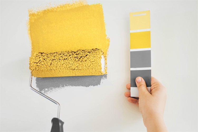
Using grey and yellow in your home
Illuminating is a pleasant, soft yellow that brightens a room without being too in-your-face or unflattering to anyone sitting near it. Ultimate Gray is smart and serviceable and can be warmed up or cooled down according to the changing seasons. The London Design Collective shares some interior design inspiration based on Ultimate Gray and Illuminating.
During the pandemic when the days seem to roll into each other and we are spending an awful lot of time at home, it makes sense to pay extra attention to your living environment, perhaps by freshening up the paintwork or updating your throws, cushions and window treatments.
With judicious use of self-storage, you can enjoy keeping your space looking fresh, interesting and stylish no matter what the season and no matter what the trend setters prescribe. It costs less than you think to keep your out-of-season homewares and textiles (see our post on costing up storage to get an idea of how much storage might cost) and at Store and Insure we can help you save money on insuring your stored domestic goods.
Learn more about Illuminating and Ultimate Gray
High fashion magazine Vogue interviewed the powers-that-be at Pantone and the resulting article explains some of the decision-making behind the colour of the year.